UX for Kids (kinda)
This is the page description.
— UX for Kids (Kinda) —
“I try to hook the parent first — if they think it looks cool and can see their own lifestyles reflected in the game play, then I know they’ll give it to their kids. You instantly become a brand they can trust — and always come back to.”
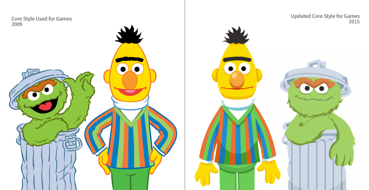
“When I first got to Sesame, games used assets from the core style guide. Worked well for books and apparel — but was a nightmare to animate (and dated the overall look of the games). With the agency CloudKid, we finally got the assets we needed to make budget efficient, and trend-focused games. We saw engagement numbers on games nearly triple by the end of the following year.”
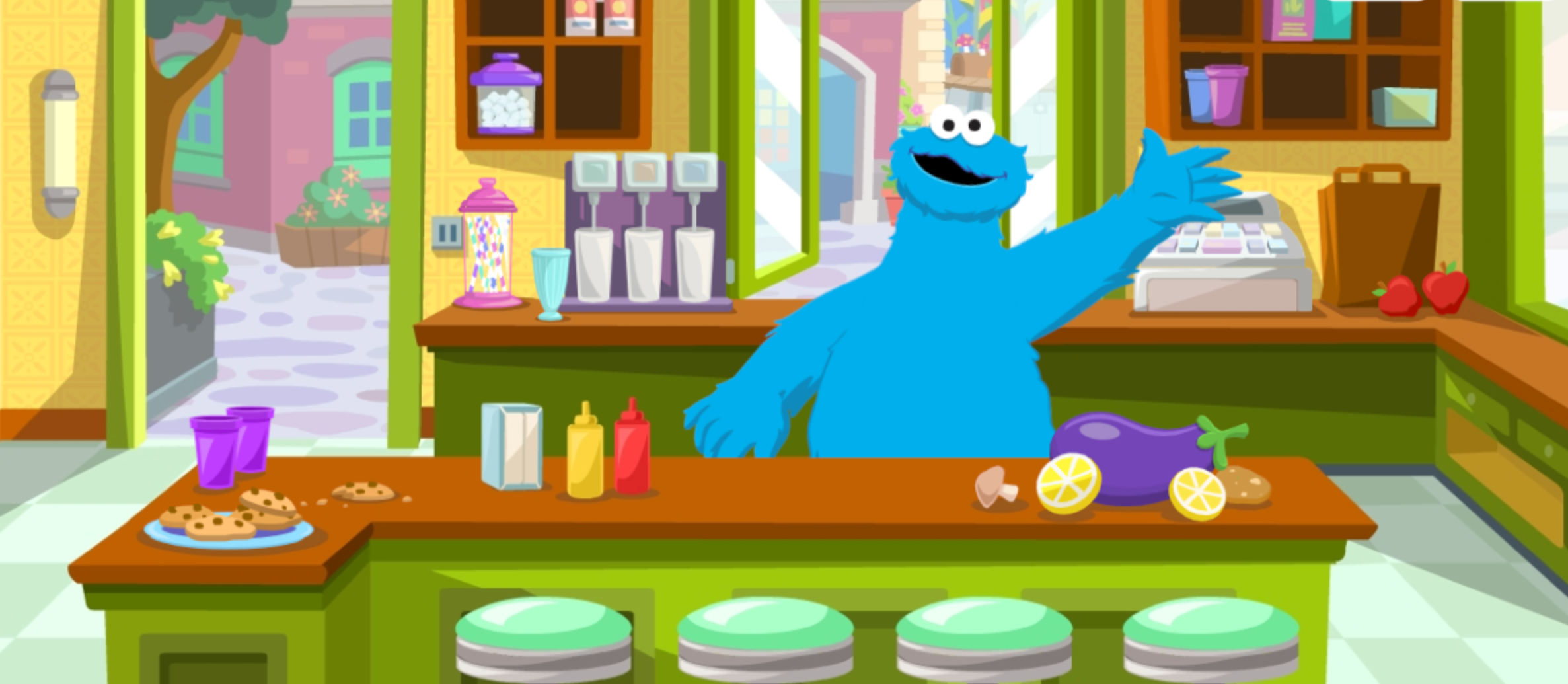
Cookie Monster at Hoopers, Muppet Section | visit site (profile required)
Role: Art Direction / UX lead
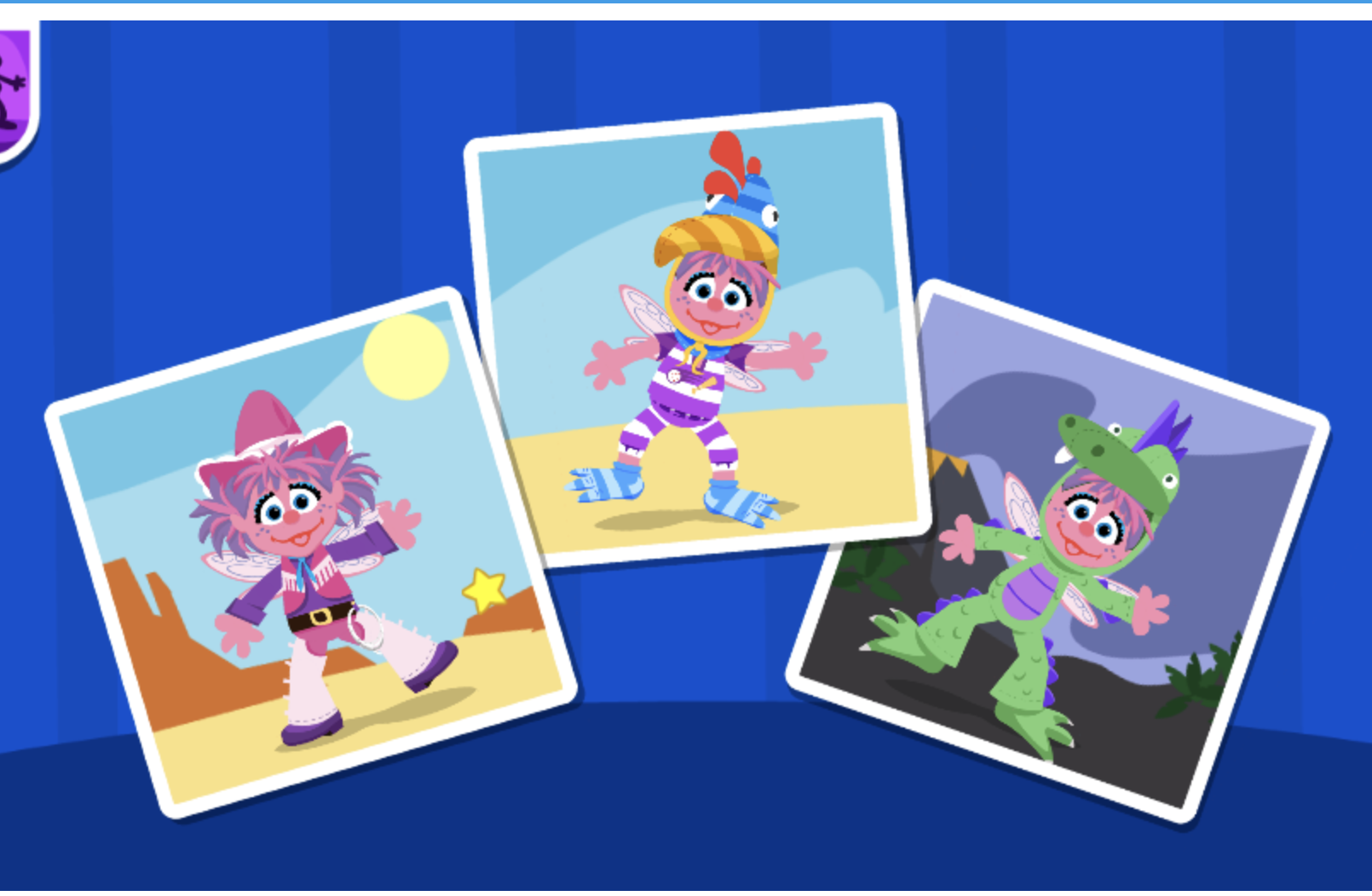
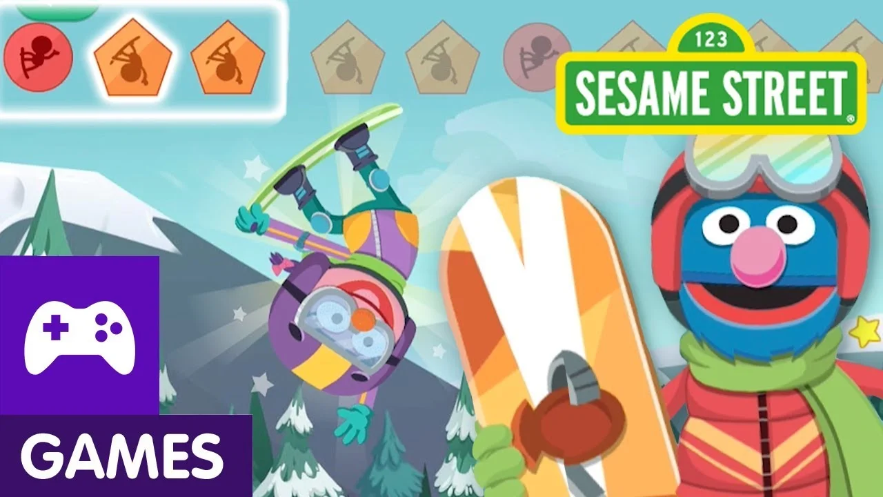
Dress Up Time | play the game
Role: Art Direction / UX lead
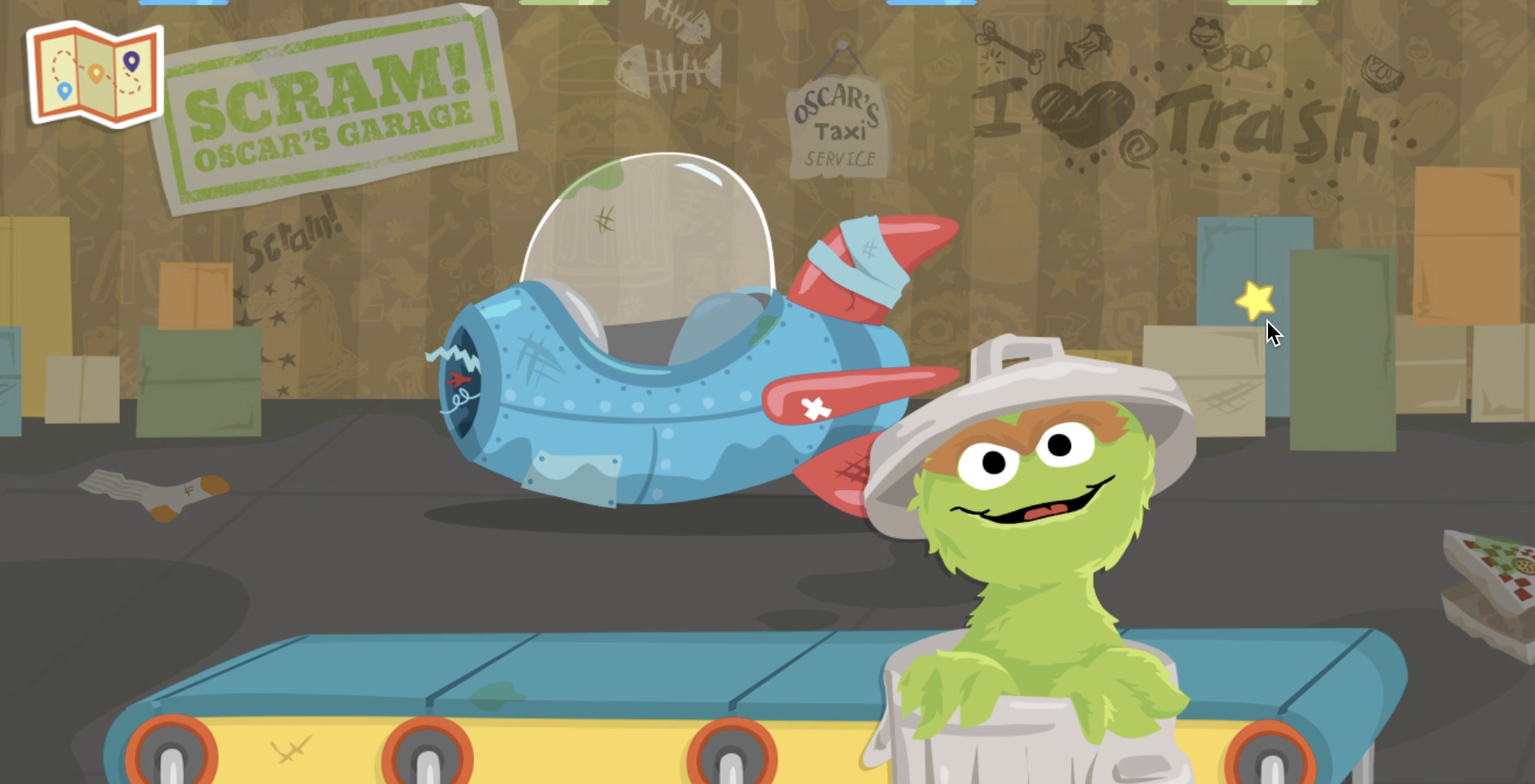
Oscar’s Rotten Ride | play the game
Role: Art Direction / UX lead
“Toddler’s can’t read. So all the standard UX rules go out the window when you’re designing for them. You have to use every color, sound, symbol and animation with a lot of care. If a child has to pass the device back and forth to a parent in order to use our site, something isn’t working. We’re doing something wrong.”
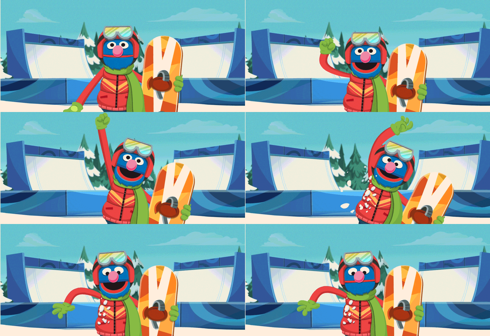
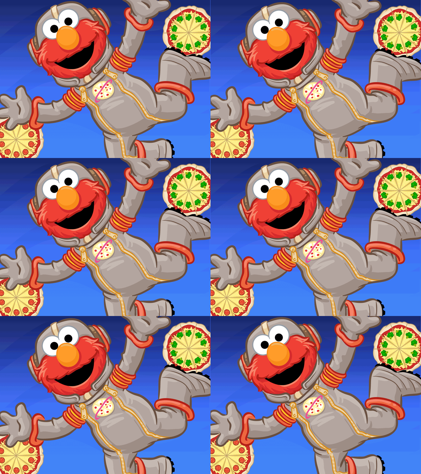
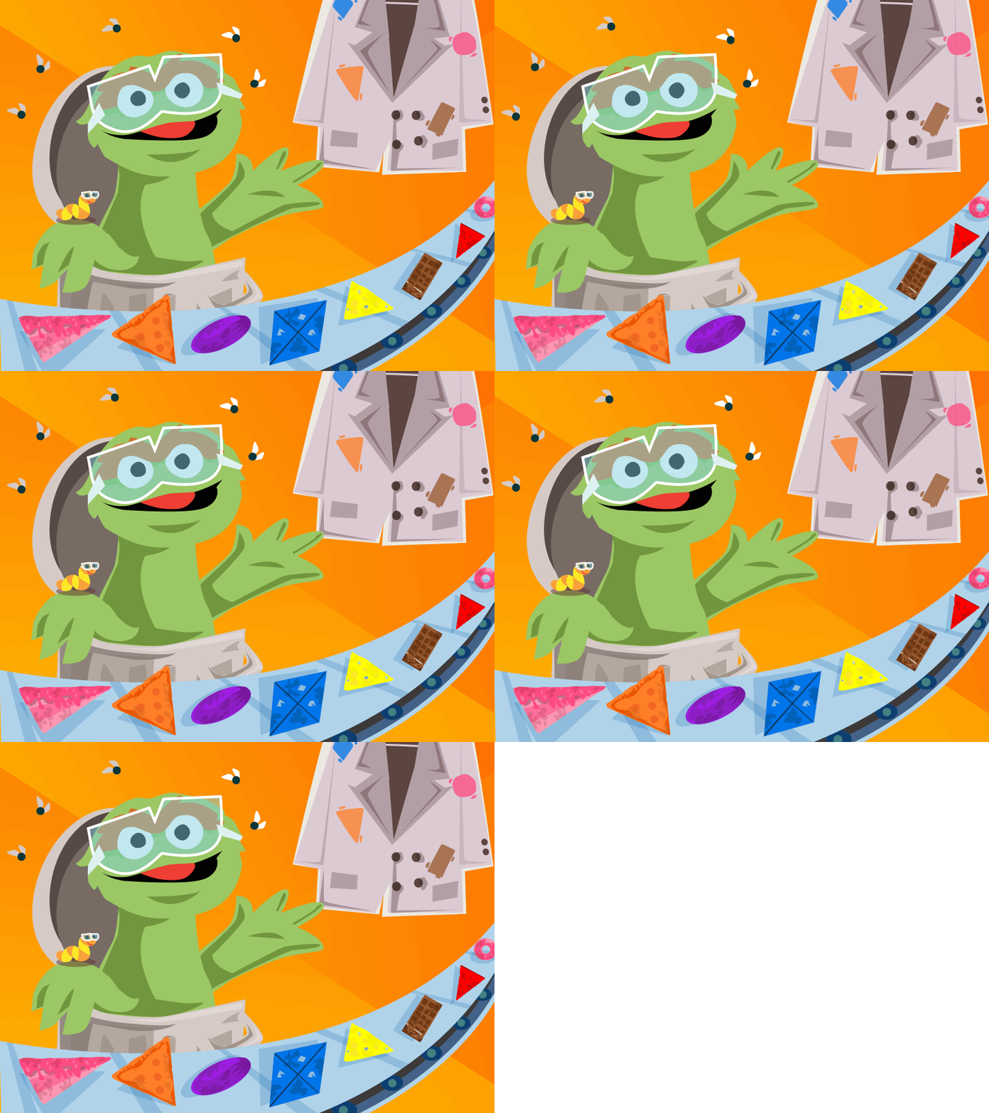
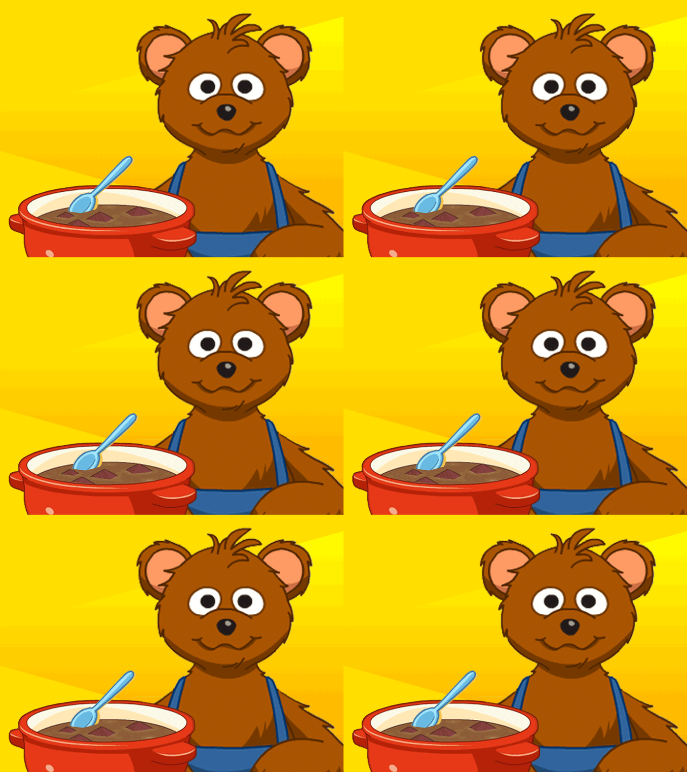
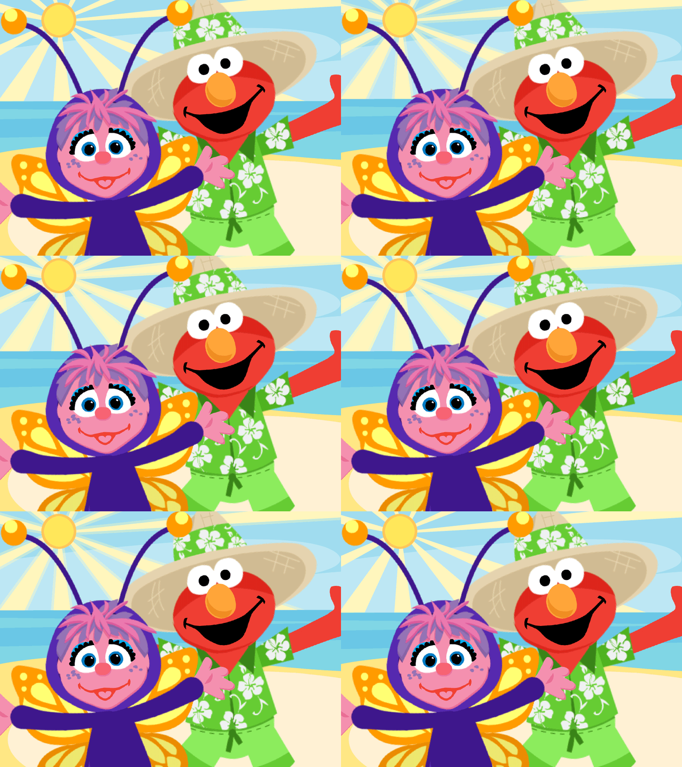
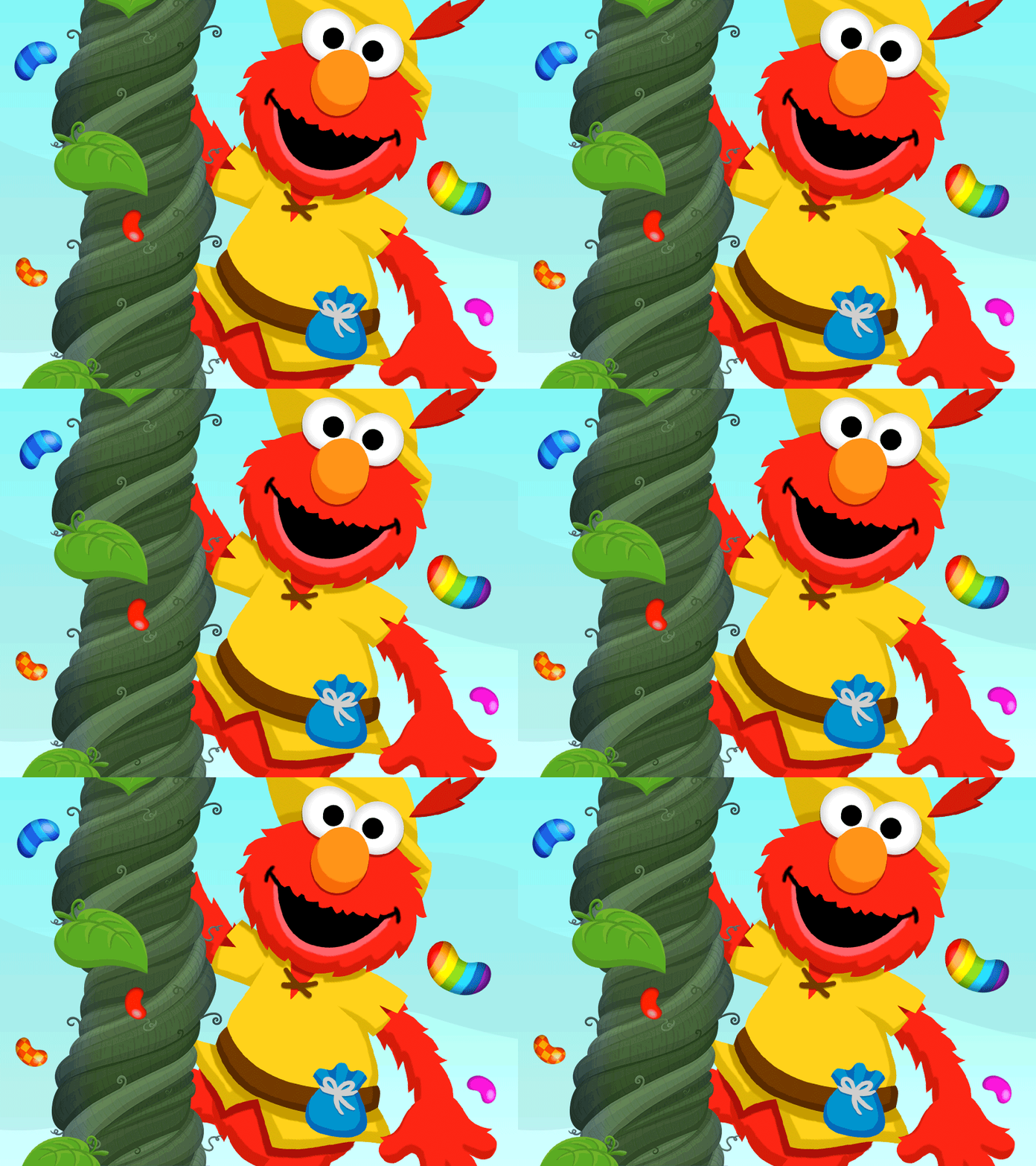
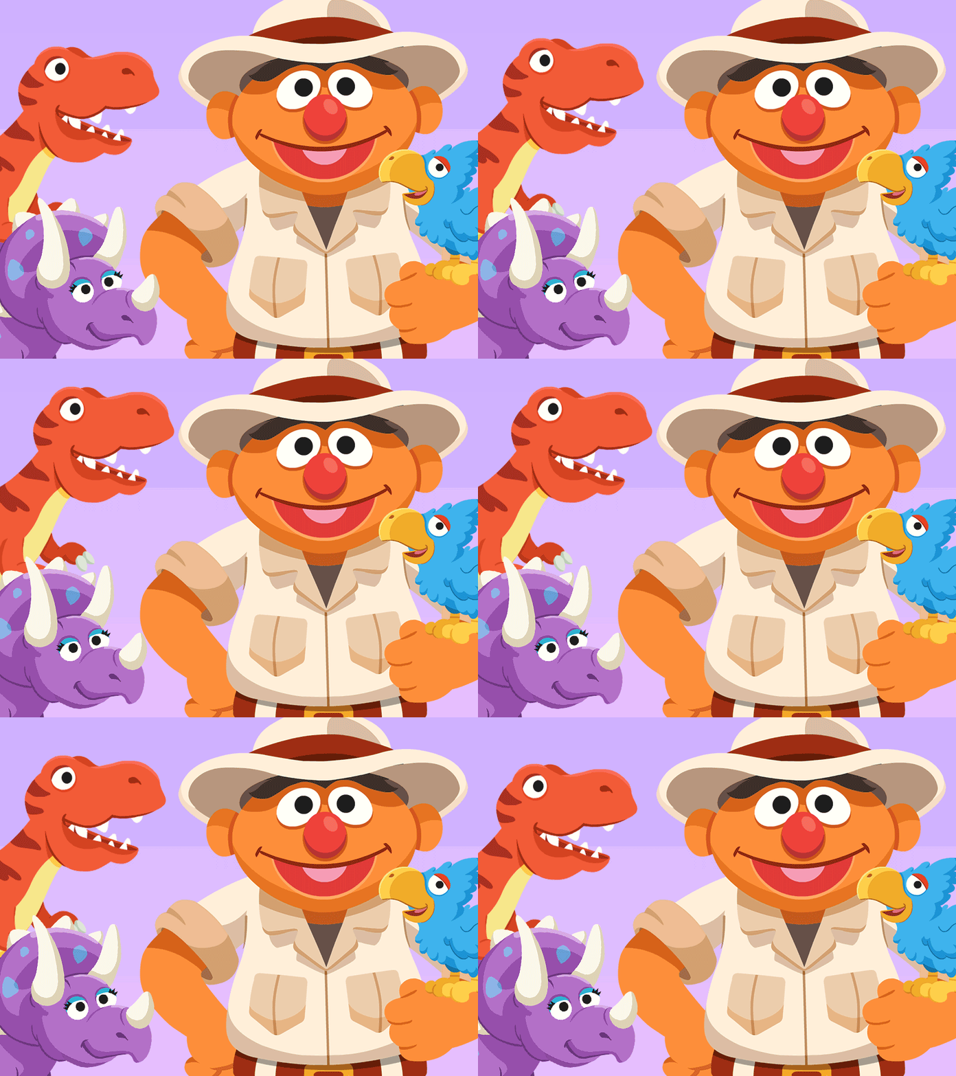
“In 2016, I convinced the stakeholders on redesigning over 200 thumbnails on the website, using staggered, subtle motion to help children navigate better. By simplifying the backgrounds, isolating characters and eliminating copy in thumbs, click through increased 60% and engagement by 80% in six months.”
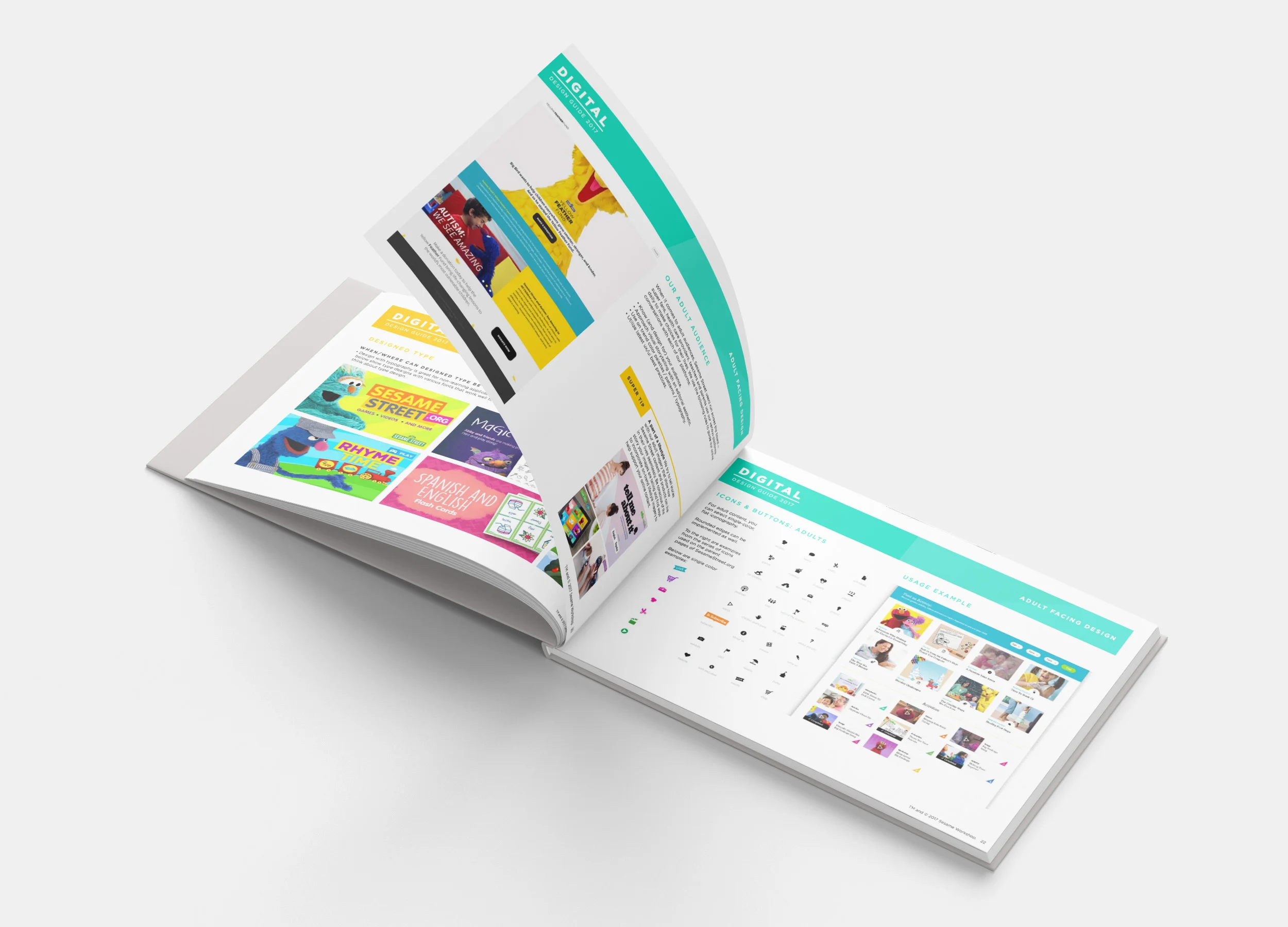
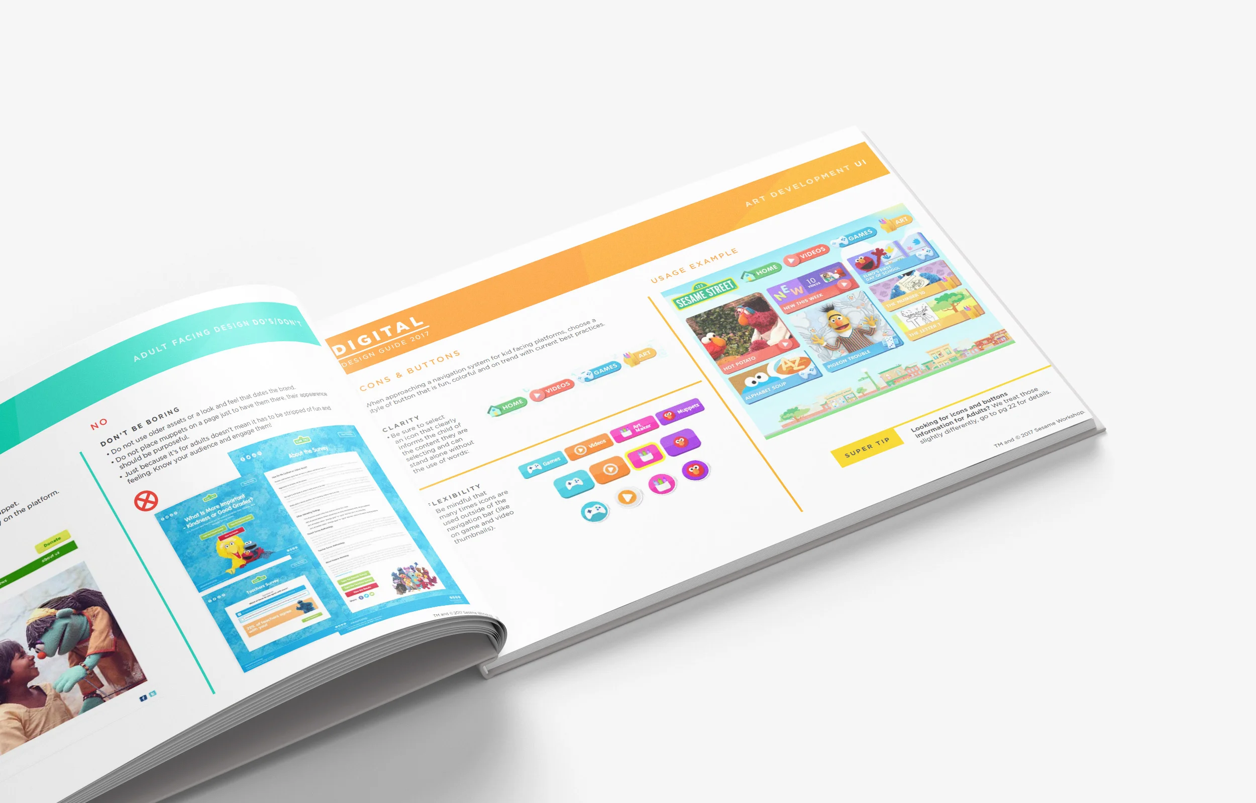
“For years, all the knowledge of how to design for kids were locked away in the minds of makers, with no real documentation to share with our partners and agencies. Stakeholders immediately bought into my proposal for a digital style guide, manifesting six months later with character animation, UX, and art direction guidelines.”
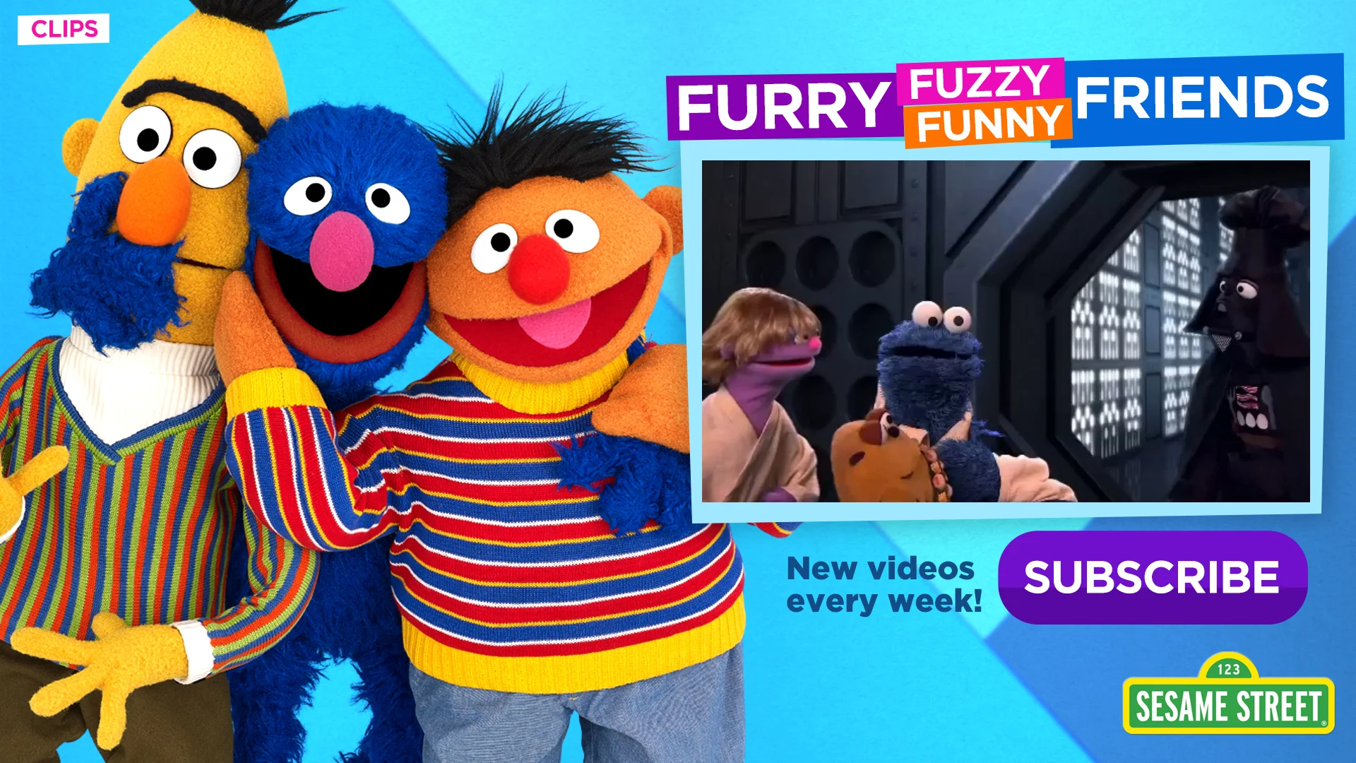
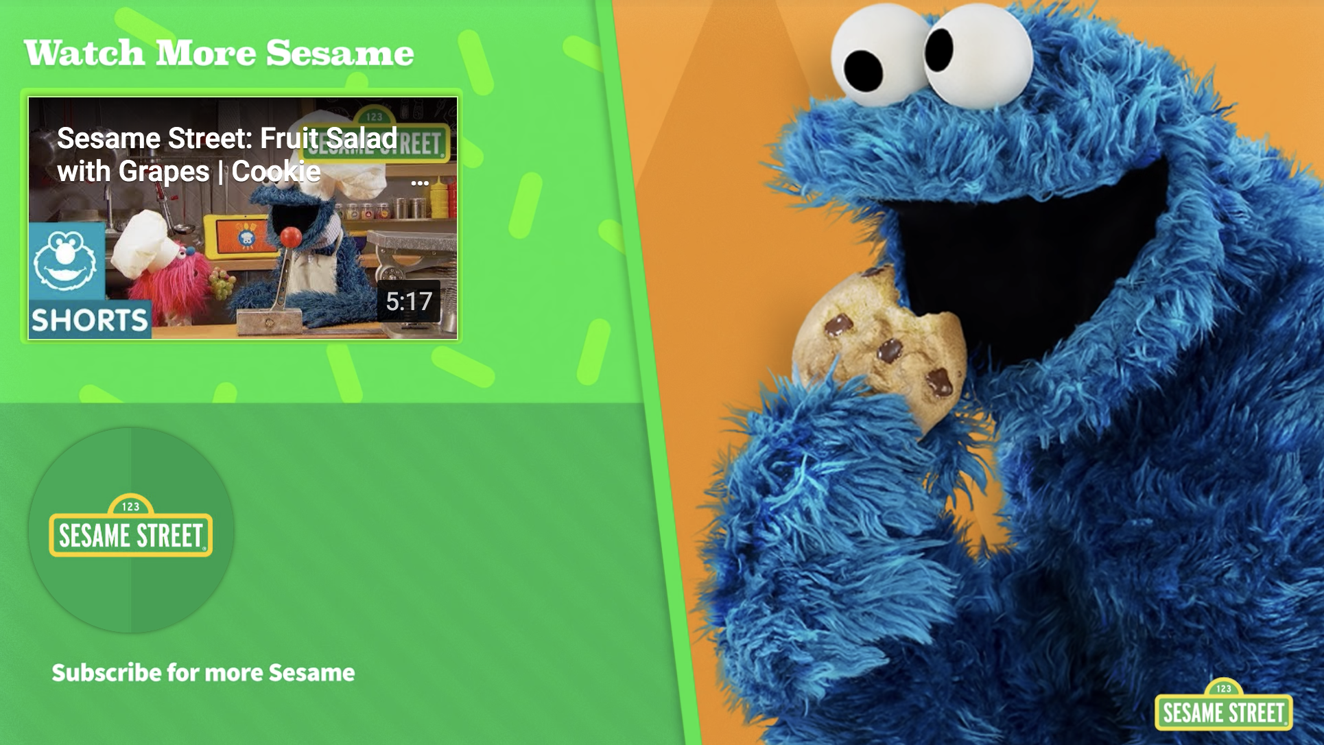
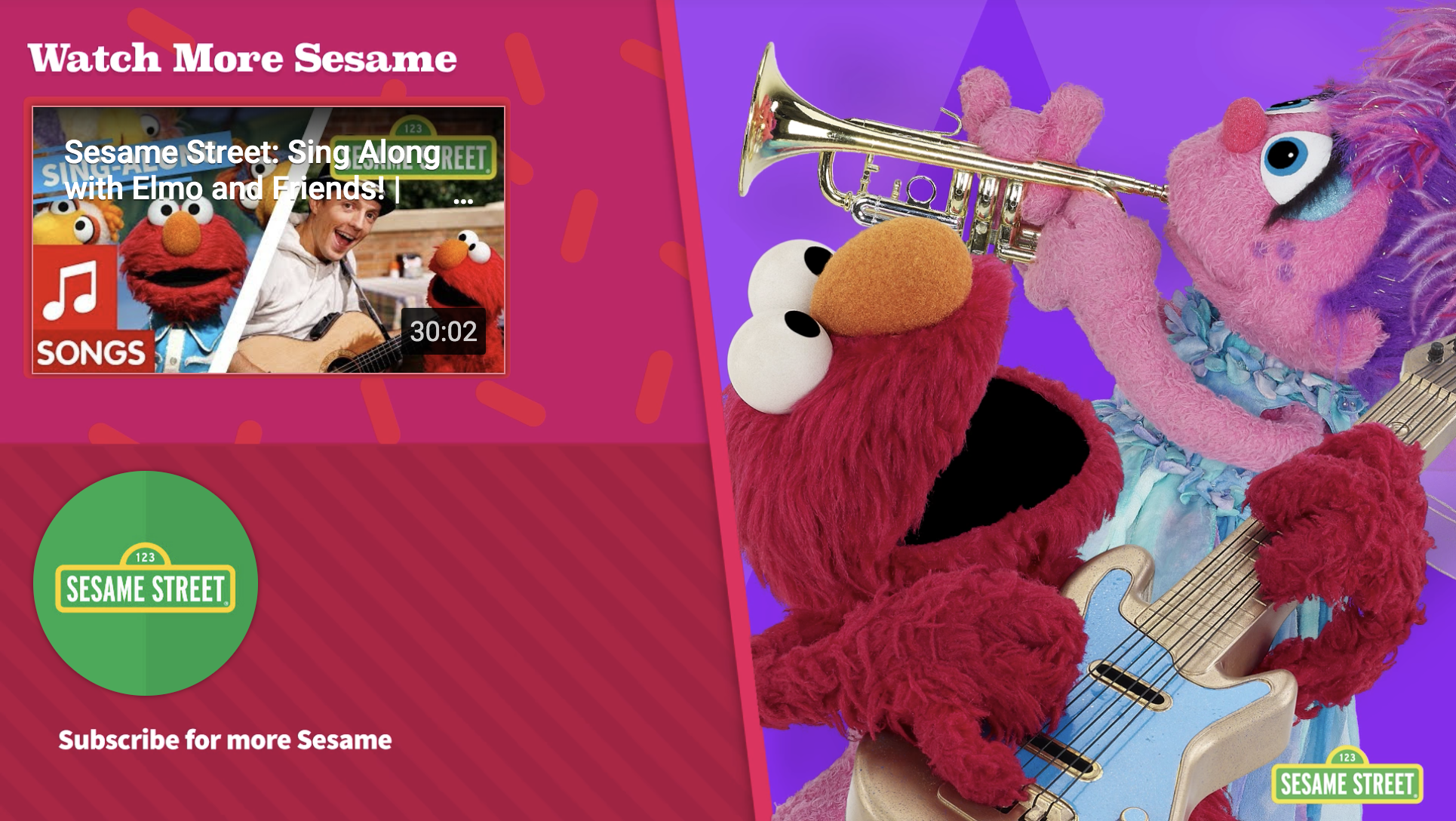
Youtube Design Strategy: End cards & Thumbnail iconography, Featured in YouTube’s playbook in 2015
Role: Art Director

